-
What do these symbols mean?
By Michel Baudin
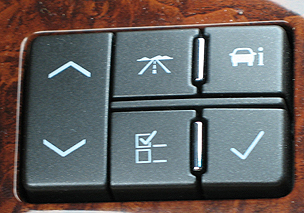
 This photo, from a Cadillac car I rented,
shows one of the most bewildering sets of controls
that I have seen. I never could figure out what some
of these controls did, even after trying them.
It appears that these were intended to imitate European designs,
that rely on pictograms to communicate with drivers
from countries with different languages.
Design suggestion
Symbols or pictograms have an obvious advantage over words in locations where words would be in an unfamiliar language. For example, the familar symbol for headlight would be more obvious to more people in the USA than
the German word "Scheinwerfer".
However, in the USA, most people read a common language, English, so using symbols instead
of words for controls is unnecessary.
Symbols do have an advantage over words in that they take less space resulting in a "cleaner" design. Using symbols that are familiar to most people is fine. Familiar symbols are typically standard symbols in widespread use.
Using unfamiliar symbols is problematic when people can not understand the symbols without additional information, such as having to read a manual. This is especially problematic in situations, such as renting a car, where people may not have a manual or may not have the time or inclination to read one. In these situtions, symbols could be replaced by or accompanied by a word, in the common language, describing the control.
Copyright © Michael J. Darnell 2006-2010. All rights reserved.