-
Yikes! I pressed the call button again!
 During a recent airline flight,
I accidentally pressed the
call button when I was trying to turn on the
overhead reading light (See Photo A.)
The call button notifies the flight attendant,
who needs to come to your
seat to turn the notification light off. You can't
turn it off by yourself.
Later, when I actually pressed the call button a second
time by mistake, I felt embarrassed.
But I felt less embarrassed
when a passenger
across the aisle accidentally pressed
their call button! Why were the call buttons getting
pressed by accident?
Both the call button and reading light button are on a panel on the inside armrest of your seat. The two buttons are the same size and same shape and differ only in their icons and positions on the panel. The call button icon is a little stylized person and the reading light icon is a little light bulb. Of course, in the dark, when you are trying to turn on the light, you can't see the icons on the buttons, and when you feel around for the buttons, the two buttons feel exactly the same. It's only by their positions on the panel that you could identify them, assuming you looked at the panel before it got dark and you remembered their positions. Actually, it isn't that easy to see the buttons even when it's light because the armrests are so close to you. Well, that's the way it is in coach.
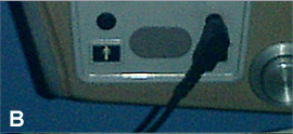
The second time I pressed the call button by accident, which didn't make me too popular with the flight attendant, I had my earphones plugged in (See photo B.) The earphone jack is right above the light button so the earphone cord hangs down over the light button. That didn't make it any easier to find the light button in the dark!


Design suggestion
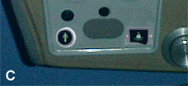
If the buttons were lit, it would be easier to identify their icons in the dark. Also, if the earphone jack was positioned between the call button and light button, the earphone cord would not cover either one.Ideally, if the two buttons differed by other features besides just their icons and positions on the panel, they would be less confusing. For example, the call button could be a recessed push button and the light switch could be a rocker switch (See Photo C.) This would make it possible to feel the difference between the two buttons and to know which was which, even in the dark.
Modern airplanes have the call button and reading light buttons on a panel on the ceiling above the seat. They are larger, lighted, easier to see and less likely to confuse. The light buttons are also close to the lights, so it is easier to find them. I've seen people look up at the overhead lights to find a light switch even when the light switch is on the armrest.
Copyright © Michael J. Darnell 2006-2010. All rights reserved.