-
Staplers
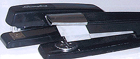
 One
of these staplers is more difficult to use than
the other. The nearer one is harder to line
up from above because the handle blocks your view of
where the staples come out. As a result, when
you use the stapler you sometimes miss the paper.
Design suggestion
From the side, the nearer stapler looks fine. You can easily see where the staples come out. But if you take the viewpoint of the user, directly above the stapler, you can't see where the staples come out. The lesson here is that when you design a device, take the view point of the user.
Copyright © Michael J. Darnell 1996-2010. All rights reserved.