-
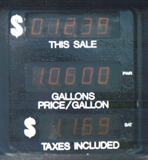
How much is the gas?
 When
I get gas for my car, I have to make an effort
to read this gas pump display carefully or
I confuse the dollar cost of the
gas purchased with the amount of
gas purchased. I need to know the
dollar cost, not the number of gallons.
It doesn't look like it would be
confusing, but it is. The dollar cost
should be more obvious. A person shouldn't have to make
an effort to read a display like this.
Design suggestion
When you have several similar displays close together and lined up, people will confuse them with each other. The displays could be different sizes, positions, colors, etc.Further thoughts
Yesterday a friend and I were at a convenience store getting gas. The gas pump had exactly the same display as is pictured above. We got 10 gallons for 13 dollars and my friend went in to pay thinking that the gas was 10 dollars. So there really is something confusing about this display!
Copyright © Michael J. Darnell 1996-2010. All rights reserved.